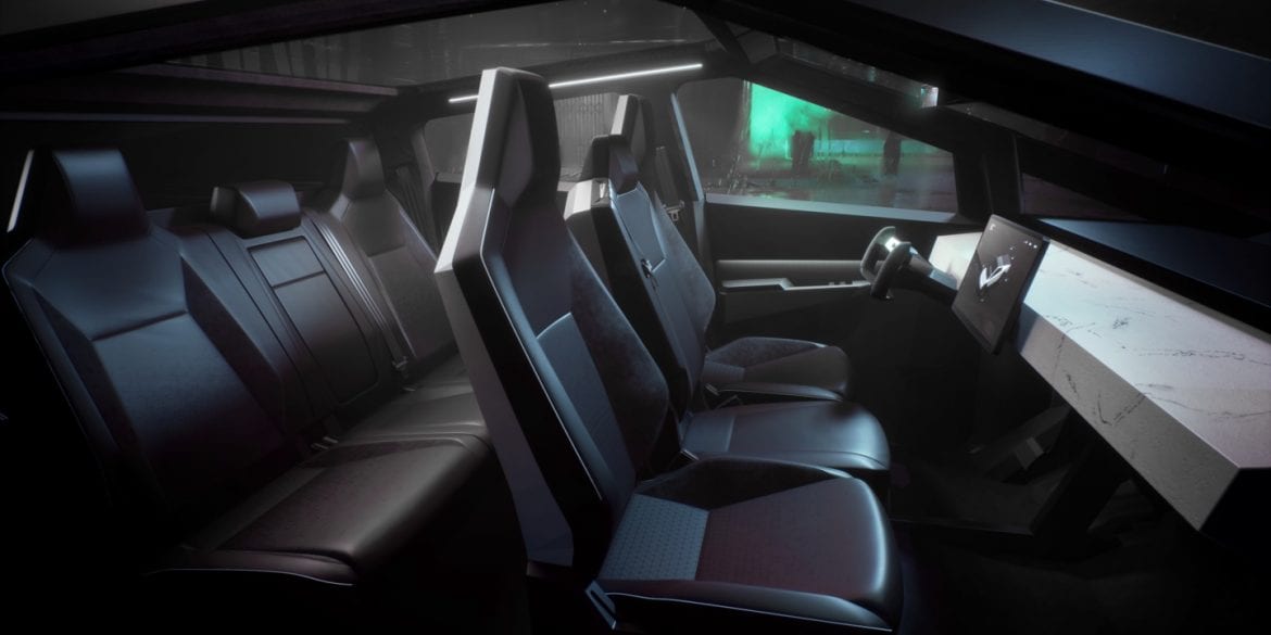
There are still a lot of mysteries surrounding the upcoming Tesla Cybertruck. The electric pickup was unveiled over a year ago at this point, but neither the interior nor exterior has been seen in a final production form. In fact, as far as the interior is concerned, we have only seen a couple of renderings. However, while it’s not much, we did catch a possible further look at what the Cybertruck user interface will look like.
Recently we have seen a portfolio piece from design studio Modern Grafik Anstalt that included a quick look at the Cybertruck UI. The studio is led by Pawel Pietryka who was the Head of UI Design at Tesla for about 4.5 years before moving away from the company last month. On the site, we can see that Pietryka has both the UI for the refreshed Model S/X and Cybertruck listed.
What’s interesting is that many, including us, assumed that the new UI that we saw in the refresh was going to be the new V11 software update design and would be standard across all models. However, on the quick run-through of the Cybertruck UI, we see that the electric truck might be getting a bespoke UI.
The design itself is darker and more technical-looking than the Model S UI. Another small change is that the functions are aligned on the left side of the screen rather than along the bottom. We also see that the Cybertruck virtual model is a prominent part of many of the functions and is visible on the screen during a lot of the interactions.
What do you guys think of the potential Cybertruck UI? Let us know down in the comments below.
