What kind of user interface your next car has probably isn’t too high on your list of considerations when thinking of getting a new car. And rightfully so, things such as price, performance, and overall design should take precedence over how the car’s infotainment system is crafted. After all, the main point of a car is to take you to your destination, not to provide a superb user interface within its menus. That was until companies like Tesla innovated ways to bring technology found in your phone to your car.
With car interiors slowly morphing towards having the entire center console consumed by giant screens it might pay to start paying a bit more attention to how much effort has been placed in its user interface. What once was just a tiny screen that told you the time and radio station a few decades ago, has now grown into basically taking control of the entirety of your car in some models.
Need navigation? Use the screen. Wanna see who is calling you? Use the screen. Need to change the A/C temperature? Sorry buddy, they got rid of those buttons too, use the screen.
Point is, you are going to be interacting with screens a lot in your future cars if the current trend continues, so it’s good to maybe pay attention to what the interface looks like and how easy it is to navigate when you look at your next car.
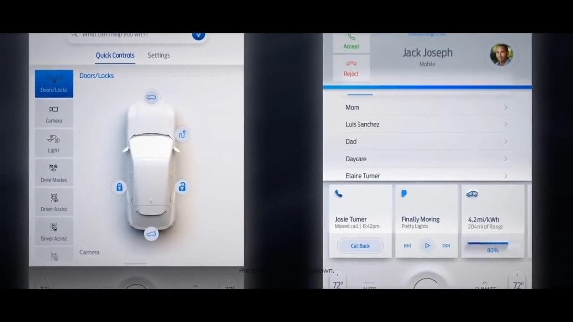
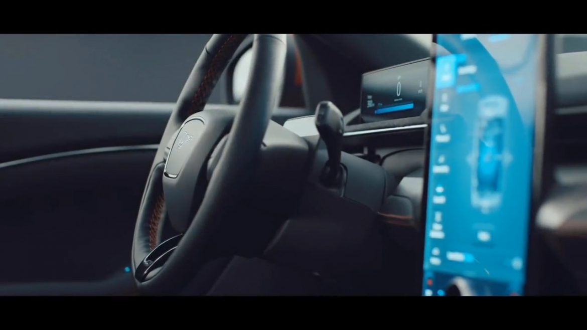
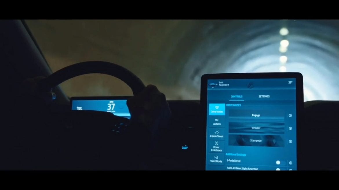
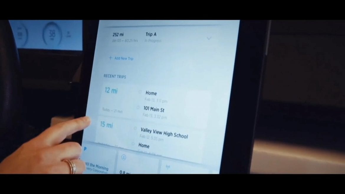
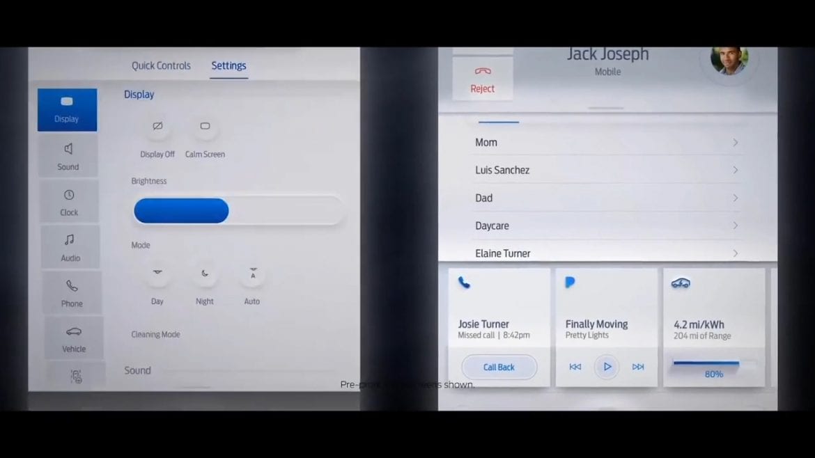
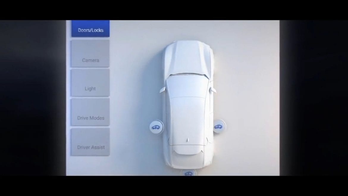
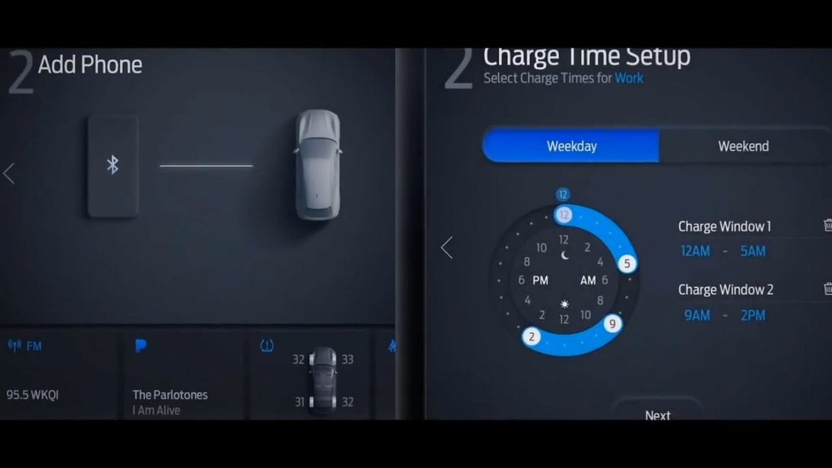
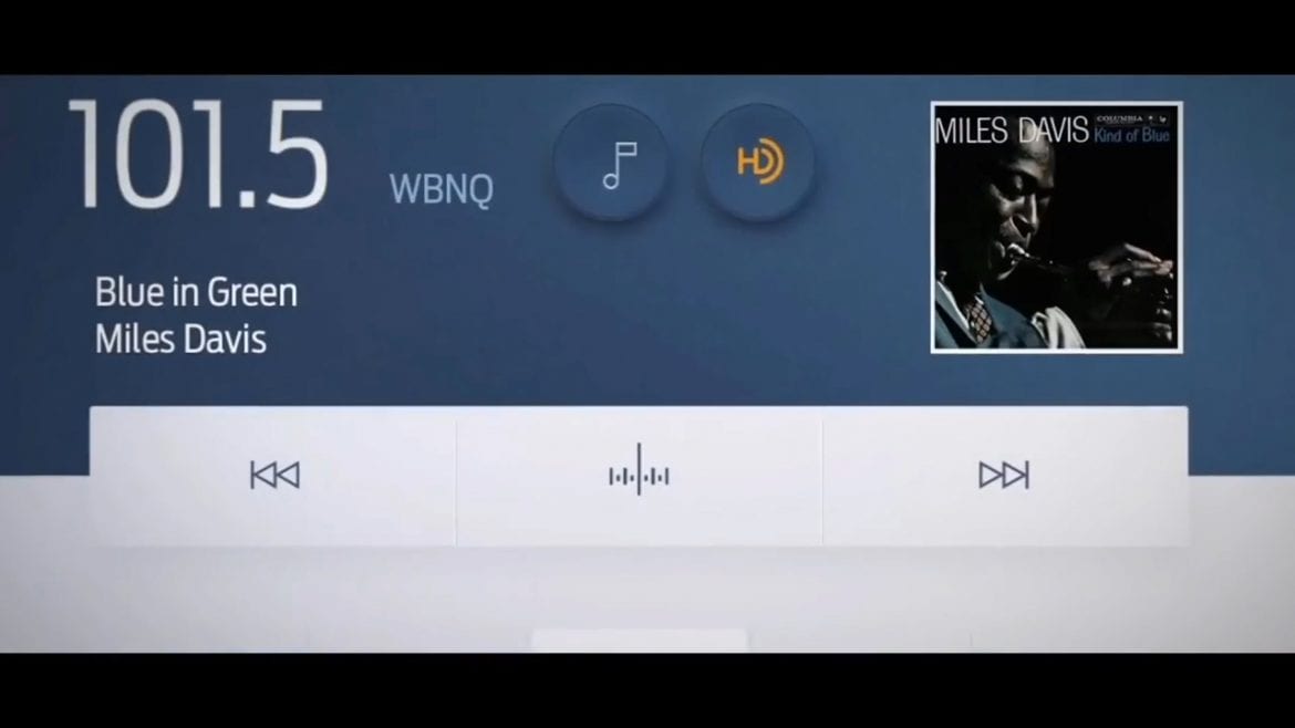
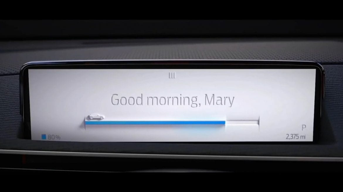
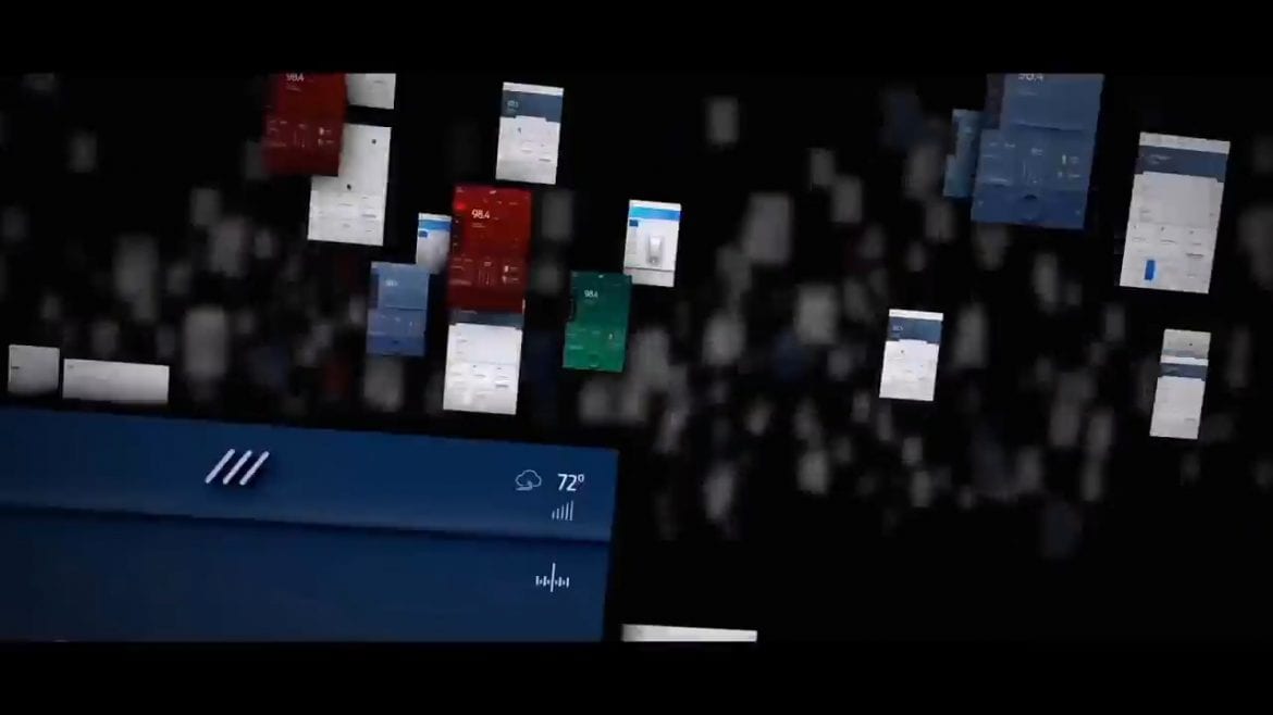
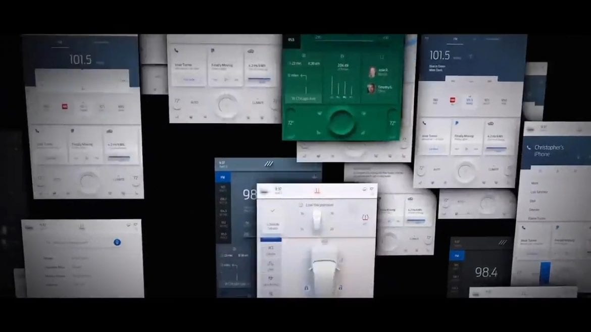
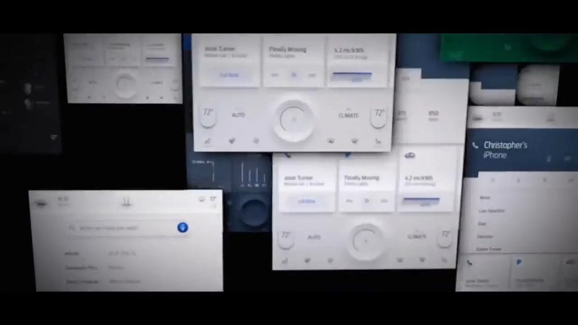
This brings us to some new images we received that detail some of the design aspects of the user interface that will be found in the upcoming Ford Mustang Mach-E touch screen.
Many automakers who are designing their new interfaces for these large screens tend to take inspiration from Tesla’s UI design. Personally, I feel like there are only so few ways to arrange icons on a screen and still be useful, so there are bound to be similarities between UIs.
Regardless, the UI found in the Mach-E screen looks to be one of the most bright and unique that I have seen thus far. The UI team seemed to have wanted to have some fun with the look and decided towards a neumorphism design, which while trendy in the UI corner of graphic design, hasn’t really been used in a car interface to my knowledge.
All-New next-generation SYNC® assists you while driving. It gets to know you and can adapt to what you need and like. Pre-order your #MustangMachE today. https://t.co/cnlXv9Pf8i pic.twitter.com/yT9aAQ64DE
— Ford UK (@forduk) July 22, 2020
It might seem silly to focus on something like that, but given how large these screens are getting, the interface shown on the Ford Mustang Mach-E display is as much a part of the interior design as the steering wheel, so you might as well find something you like. Plus it’s indicative of the effort Ford has put in the creation of the Mach-E as a whole, it doesn’t look like the standard run of the mill car interface.
Now it’s not all radical, there’s no point of being different for the sake of being different if it ends up being a detriment. The actual layout of the interface seems to use a card system with three different cards on the bottom, each populated with information of your choosing, such as current range, current song, pertinent notifications from your phone, etc. While these cards presumably persistently stay on the bottom third of the screen, the top third of the screen will switch between main apps, such as the radio station or navigation system.
The actual layout isn’t radically changing anything, but the choice to use a rather obscure design language does give the UI its own character and sets itself as a differentiator when looking at the infotainment systems of some other cars.
How do you guys feel about the design? Let us know down in the comments below.
