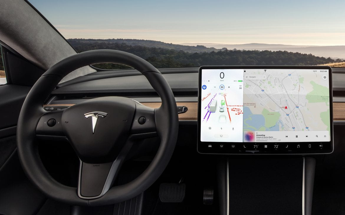
While vehicle powertrains are seeing a shift towards more sustainable options and automakers are working on having cars drive themselves, we are also seeing an evolution of the standard car interiors that we all grew up with. As technology becomes more and more prevalent in our day to day lives, vehicle interior designers are ditching the old mish-mash of buttons that used to crowd the center console. In their place now stands monolithic screens that take up prime real estate on your dash. While we weigh heavily on the software experience when choosing our next phone or computer, how important might competent and sleek looking UI play in people’s purchasing decisions in the future?
Having a screen in your dashboard taking care of things such as music choice or navigation isn’t new, they have certainly hit a substantial growth spurt over the past few years and will look to be the prominent feature of any new car for the foreseeable future. Go ahead and take a look at basically any electric concept car that is slated to come out in the next 2-3 years, almost every single one of them features screens taking up not only the majority of the center console, but have also replaced the traditional gauge cluster.
While you can say electric cars are transitioning away from the analog-like gasoline engines to the more digital-like electric power, it seems that that same ‘digification’ is happening within the interior of vehicles as well. Physical buttons are being kept at a minimum and traditional gauges are being replaced with their digital counterparts. Everything from navigation, to music selection, to internal temperature is all being controlled by a single entity.
With all sorts of smart devices becoming commonplace, consumers are more aware of technological shortcomings in their lives and it seems like automakers are noticing that this need for technology is rising up in the priority list of many car buyers. You can easily notice this trend by looking at the base offerings from automakers like Toyota, Kia, Honda, etc. Each on of their low tier cars now comes with large screens, a multitude of connectivity features, and safety systems. All these options would have been limited to luxury models ten or so years ago, but now you can have those same features in cars that cost far under $30,000.
So while I am by no means saying that the car’s software is the top priority when consumers consider a car, it is quickly gaining the ranks. If you have a bad UI, or bad responsiveness, you will make doing basically anything outside of driving the car a chore to do at best and a headache-inducing hurdle at worst. With automakers now choosing to have all the car’s functions being locked behind touchscreens, it is now on them to create software that doesn’t make owners wish that they never had a screen in the first place. As a stretch goal, it should also look good.
With screens now looking to take up about a quarter of the dashboard, they should look good. When a feature commands that much space, it becomes as much of a part of the interior as the seats or the steering wheel. Quite literally it becomes the centerpiece of the interior of the car, so it better look good. Design of course is subjective, but in the future, it might be in the benefit of automakers to at least have car software that is unique to them. When we previewed the UI of the upcoming Ford Mustang Mach-E, I was pleasantly surprised by the direction the UI team went with the design language. It will not be everyone’s cup of tea, but it looks usable and distinct to the brand, you don’t want to have the same sterile menus that your competitors are using for their system.
Of course, I can’t talk about large screens in cars without mentioning Tesla. The electric car brand has put on display the endless possibilities of different ways to utilize a vehicle’s infotainment system. The brand has crammed in a whoopie cushion, drawing program, music production program, streaming services, and full-fledged video games, just to name a few. Has anyone purchased a Tesla for the sole purpose of watching Netflix in their car? Well, probably not. However when someone is deciding between two cars and even the smallest of things can swing preference one way or another, that in-car theater might be enough to sway opinions. When you look at comparisons like the Tesla Model S vs Lucid Air, software and UI seem to be the largest separation. No other automaker is even close to having the offerings that Tesla has in their vehicle software, but if this sentiment towards appealing towards people’s technophilia continues then we might see some competition in the next decade.
All of these features mentioned are in part thanks to Tesla’s software updates. Side-by-side with the term “technologically advanced” comes software. Previously, a UI was only as good as it’s release date. With this new age of smart phone-esque cars, software updates have become a norm. With them automakers can continuously add and improve features, some never before seen in vehicles. After all, why would anyone want to buy a piece of tech at this price tag that will be outdated in just a short few months?
One thing is for sure, automakers will have to start bolstering their vehicle software and UI teams, as it will soon be unacceptable to deliver cars with sub-par software user experiences. Tesla for instance has already begun expanding their software development team to keep up with what consumers want. In this case, it’s Tesla games, but where this new norm will take us is unbound.
Will we look at the vehicle software of today in 20 years the same way we look at MS-DOS systems currently? With how fast we are progressing, it’s crazy to think about, but it might be the case.
