The Lucid Air is right around the corner with deliveries starting sometime in the second half of this year. With the release date so close, we have seen basically all there is to see in the upcoming electric sedan. However, one part of the Lucid Air that has eluded us was the final version of the software user experience and UI that will ship with the car. Recently, the brand has given us a look at the workings of its upcoming UX.
In the above nine-minute-long video, Derek Jenkins, Senior VP of Design and Brand walks us through the new Lucid software experience. Jenkins remarks that in the same way that Lucid was able to build the Air from a blank sheet with no prior foundations or considerations, so to was the team able to build an intuitive and exception software experience:
“In much the same way that a holistic, clean-sheet approach to design and engineering has made possible the revolutionary packaging and efficiency of Lucid Air, this built-from-the-ground-up strategy has also enabled the creation of Lucid UX, a truly innovative human-machine interface that is easy-to-use and aesthetically beautiful. Lucid UX retains specific aspects of a traditional physical interface and pairs those with an innovative digital form factor that’s highly advanced and ergonomic, providing intuitive access to all vehicle systems.”
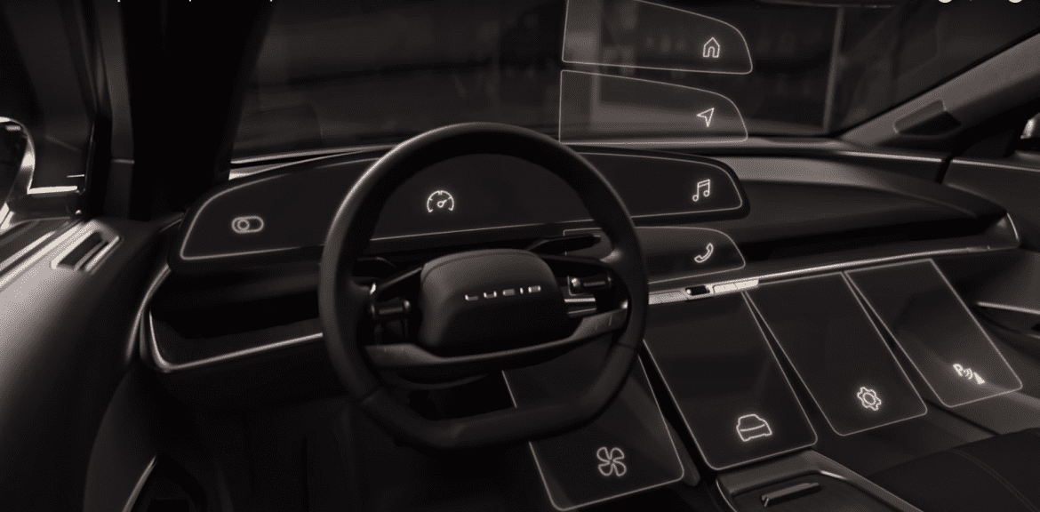
As is customary now, the Lucid Air interior is dominated by two large screens, although it does feature a slightly more novel orientation than we are used to. What Lucid calls the “glass cockpit” is actually a 34-inch screen. It spans from the left of the steering wheel all the way to where a traditional center screen would be.
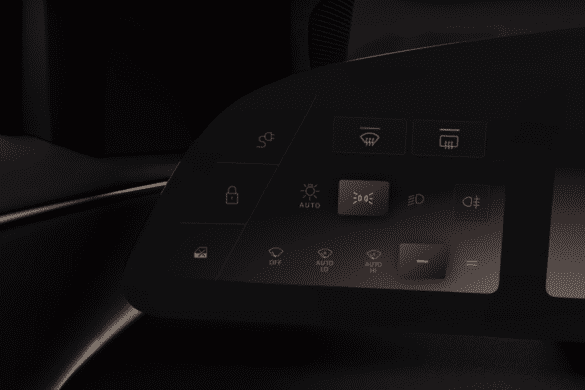
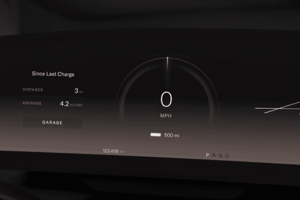
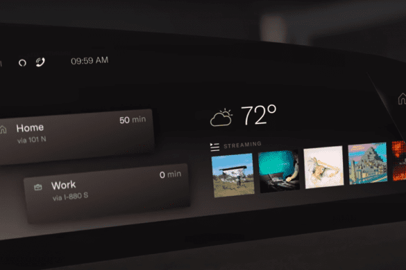
This large screen is actually subdivided into three smaller screens with the two flanking the steering wheel being touch-sensitive. As you can imagine the center portion acts as a traditional gauge cluster. The left screen manages vehicle controls such as window defrosters, lighting, and wiper settings. The screen on the right manages things like the radio and navigation.
To the bottom right, you will see what Lucid calls the “pilot panel”. The panel is there to provide further controls such as drive modes and climate control. Additionally, you can swipe panels down from the top screen to the pilot panel to get a large viewer and receive additional controls. Most interestingly enough (and a favorite quirk of mine) is that the panel can be retracted into the center console to access additional storage.
As I’ve stated before, the UIs that are found in cars moving forward will be as much a part of the interior design as the steering wheel or seats, so it’s important that attention is paid to design. Lucid has thought of that and designed their UI to be “warm and inviting”. They also have different color themes for the UI that match all their interior options, so you can have something that matches your interior or something completely different if you so wish.
All of these touch screens doesn’t mean that Lucid killed off their buttons. There are a decent amount of buttons and scroll wheels throughout the cockpit for like music volume and climate control. Lucid states that all of these buttons and switches have gone through over 100 iterations in terms of shape, weight, resistance, and so on. As you all may know at this point, I’m a fan of a good button, so I will put them to the test whenever I get a chance to get into an Air.
The system supports Alexa, Apple Carplay, Android Auto, Spotify, and Tidal, just to name a few. And with over-the-air software updates, we expect to see more features and services possibly come to the car in the future.
How do you guys feel about the Lucid UI? Let us know down in the comments below.
Source: Lucid


